Matplotlib
Matplotlib is a python 2-d plotting library which produces publication quality figures in a variety of formats and interactive environments across platforms. Matplotlib can be used in Python scripts, the Python and IPython shell, web application servers, and six graphical user interface toolkits.
Documentation
The matplotlib documentation is extensive and covers all the functionality in detail. The documentation is littered with hundreds of examples showing a plot and the exact source code making the plot:
- Matplotlib home page: key pylab plotting commands in a table.
- Matplotlib manual
- Thumbnail gallery: hundreds of thumbnails linking to the source code used to make them (find a plot like the one you want to make).
- Code examples: extensive examples showing how to use matplotlib commands.
Hints on getting from here (an idea) to there (a plot)
- Start with Screenshots section of the manual for a broad idea of the plotting capabilities
- Most of the high-level plotting functions are in the pyplot module and you can find them quickly by searching for pyplot.<function>, e.g. pyplot.errorbar.
Pylab and Pyplot and NumPy
Let’s demystify what’s happening when you use ipython --pylab and clarify the relationship between pylab and pyplot.
matplotlib.pyplot is a collection of command style functions that make matplotlib work like MATLAB. This is just a package module that you can import:
import matplotlib.pyplot
print sorted(dir(matplotlib.pyplot))
Likewise pylab is also a module provided by matplotlib that you can import:
import pylab
This module is a thin wrapper around matplotlib.pylab which pulls in:
- Everything in matplotlib.pyplot
- All top-level functions numpy,``numpy.fft``, numpy.random,
- numpy.linalg
- A selection of other useful functions and modules from matplotlib
There is no magic, and to see for yourself do
import matplotlib.pylab
matplotlib.pylab??       # prints the source code!!
When you do ipython --pylab it (essentially) just does:
from pylab import *
In a lot of documentation examples you will see code like:
import matplotlib.pyplot as plt  # set plt as alias for matplotlib.pyplot
plt.plot([1,2], [3,4])
This is good practice for writing scripts and programs, since it is clear that the plot command is from the matplotlib.pyplot package. We’ll adopt this alias for the examples in our course. But once you’re familiar with the commands, you can omit the plt. when plotting in the interactive ipython shell to reduce the amount of typing needed.
See Matplotlib, pylab, and pyplot: how are they related? for a more discussion on the topic.
Plotting 1-d data
The matplotlib tutorial on Pyplot (Copyright (c) 2002-2009 John D. Hunter; All Rights Reserved and license) is an excellent introduction to basic 1-d plotting. The content below has been adapted from the pyplot tutorial source with some changes and the addition of exercises.
matplotlib.pyplot is a collection of command style functions that make matplotlib work like MATLAB. Each pyplot function makes some change to a figure: eg, create a figure, create a plotting area in a figure, plot some lines in a plotting area, decorate the plot with labels, etc.... matplotlib.pyplot is stateful, in that it keeps track of the current figure and plotting area, and the plotting functions are directed to the current axes:
plt.figure()          # Make a new figure window
plt.plot([1,2,3,4])
plt.ylabel('some numbers')
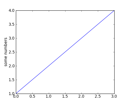
You may be wondering why the x-axis ranges from 0-3 and the y-axis from 1-4. If you provide a single list or array to the plot() command, matplotlib assumes it is a sequence of y values, and automatically generates the x values for you. Since python ranges start with 0, the default x vector has the same length as y but starts with 0. Hence the x data are [0, 1, 2, 3].
plot() is a versatile command, and will take an arbitrary number of arguments. For example, to plot x versus y, you can issue the command:
plt.clf()    # this clears the existing figure
plt.plot([1,2,3,4], [1,4,9,16])
plot() is just the tip of the iceberg for plotting commands and you should study the page of matplotlib screenshots to get a better picture.
For every x, y pair of arguments, there is an optional third argument which is the format string that indicates the color and line type of the plot. The letters and symbols of the format string are from MATLAB, and you concatenate a color string with a line style string. The default format string is ‘b-‘, which is a solid blue line. For example, to plot the above with red circles, you would issue:
plt.clf()
plt.plot([1,2,3,4], [1,4,9,16], 'ro')
plt.axis([0, 6, 0, 20])

See the plot() documentation for a complete list of line styles and format strings. The axis() command in the example above takes a list of [xmin, xmax, ymin, ymax] and specifies the viewport of the axes.
If matplotlib were limited to working with lists, it would be of limited use for numeric processing. Generally, you will use NumPy arrays. In fact, all sequences are converted to numpy arrays internally. The example below illustrates plotting several lines with different format styles in one command using arrays:
# evenly sampled time at 200ms intervals
t = np.arange(0., 5., 0.2)

# red dashes, blue squares and green triangles
# then filled circle with connecting line
plt.clf()
plt.plot(t, t, 'r--')
plt.plot(t, t**2, 'bs')
plt.plot(t, t**3, 'g^')
plt.plot(t, t+60, 'co-')

Exercise: Plot a sine curve
Make a plot of a sin curve between 0 and 4*pi shown by a green curve. Remember that the value of pi and the sine function are in the numpy namespace (np.pi and np.sin).
Click to Show/Hide Solution
plt.clf()
x = np.linspace(0, 4*np.pi, 100)
plt.plot(x, np.sin(x), 'g')
plt.xlim(0, 4*np.pi)
plt.ylim(-1.1, 1.1)
Controlling line and marker properties
What are lines and markers?
A matplotlib “line” is an object containing a set of points and various attributes describing how to draw those points. The points are optionally drawn with “markers” and the connections between points can be drawn with various styles of line (including no connecting line at all).
Lines have many attributes that you can set: linewidth, dash style, antialiased, etc; see Line2D. There are two commonly-used ways to set line properties:
Use keyword args:
x = np.arange(0, 10, 0.25)
y = np.sin(x)
plt.clf()
plt.plot(x, y, linewidth=4.0)
Use the setter methods of the Line2D instance. plot returns a list of lines; eg line1, line2 = plot(x1,y1,x2,x2). Below I have only one line so it is a list of length 1. I use tuple unpacking in the line, = plot(x, y, 'o') to get the first element of the list:
plt.clf()
line, = plt.plot(x, y, '-')
line.set_<TAB>
Now change the line color, noting that in this case you need to explicitly redraw:
line.set_color('m') # change color
plt.draw()
Wait, plot() makes a plot and returns a value?
Take note that plot() both generates the plot you asked for, and returns a list of line objects. This happens for most matplotlib plotting commands. They will generate the image, contours, histogram, or whatever you want, and also return an object that you can then use to later adjust the properties of the plotted object.
Here are some of the Line2D properties.
| Property | Value Type |
|---|---|
| alpha | a float that controls the opacity |
| antialiased or aa | [True | False] |
| color or c | any matplotlib color |
| dash_capstyle | [‘butt’ | ‘round’ | ‘projecting’] |
| dash_joinstyle | [‘miter’ | ‘round’ | ‘bevel’] |
| dashes | sequence of on/off ink in points |
| data | (array xdata, array ydata) |
| figure | The figure in which the plot was made |
| label | a string used for the legend (see below) |
| linestyle or ls | [ ‘-‘ | ‘–’ | ‘-.’ | ‘:’ | ‘steps’ | ...] |
| linewidth or lw | float value in points |
| lod | [True | False] |
| marker | [ ‘+’ | ‘,’ | ‘.’ | ‘1’ | ‘2’ | ‘3’ | ‘4’ | ... ] |
| markeredgecolor or mec | any matplotlib color |
| markeredgewidth or mew | float value in points |
| markerfacecolor or mfc | any matplotlib color |
| markersize or ms | float |
| markevery | None | integer | (startind, stride) |
| solid_capstyle | [‘butt’ | ‘round’ | ‘projecting’] |
| solid_joinstyle | [‘miter’ | ‘round’ | ‘bevel’] |
| visible | [True | False] |
| xdata | array |
| ydata | array |
| zorder | a number determining the plot order (controls overlaps) |
Exercise: Make this plot

Make a plot that looks similar to the one above. You should be able to do this just by using the format string and keyword arguments to adjust the line and marker properties.
Click to Show/Hide Solution
x = [1, 2, 3, 4]
y = [3, 2, 3, 1]
plt.clf()
plt.plot(x, y, '--', linewidth=10)
plt.plot(x, y, '*r', markeredgecolor='b', markeredgewidth=5, markersize=40)
plt.xlim(0, 5)
plt.ylim(0, 4)
